
What the Logo Actually Tells You About a Car Brand's Identity
From the prancing horse to the four rings, discover what the symbolism behind iconic car manufacturer logos reveals about brand heritage.
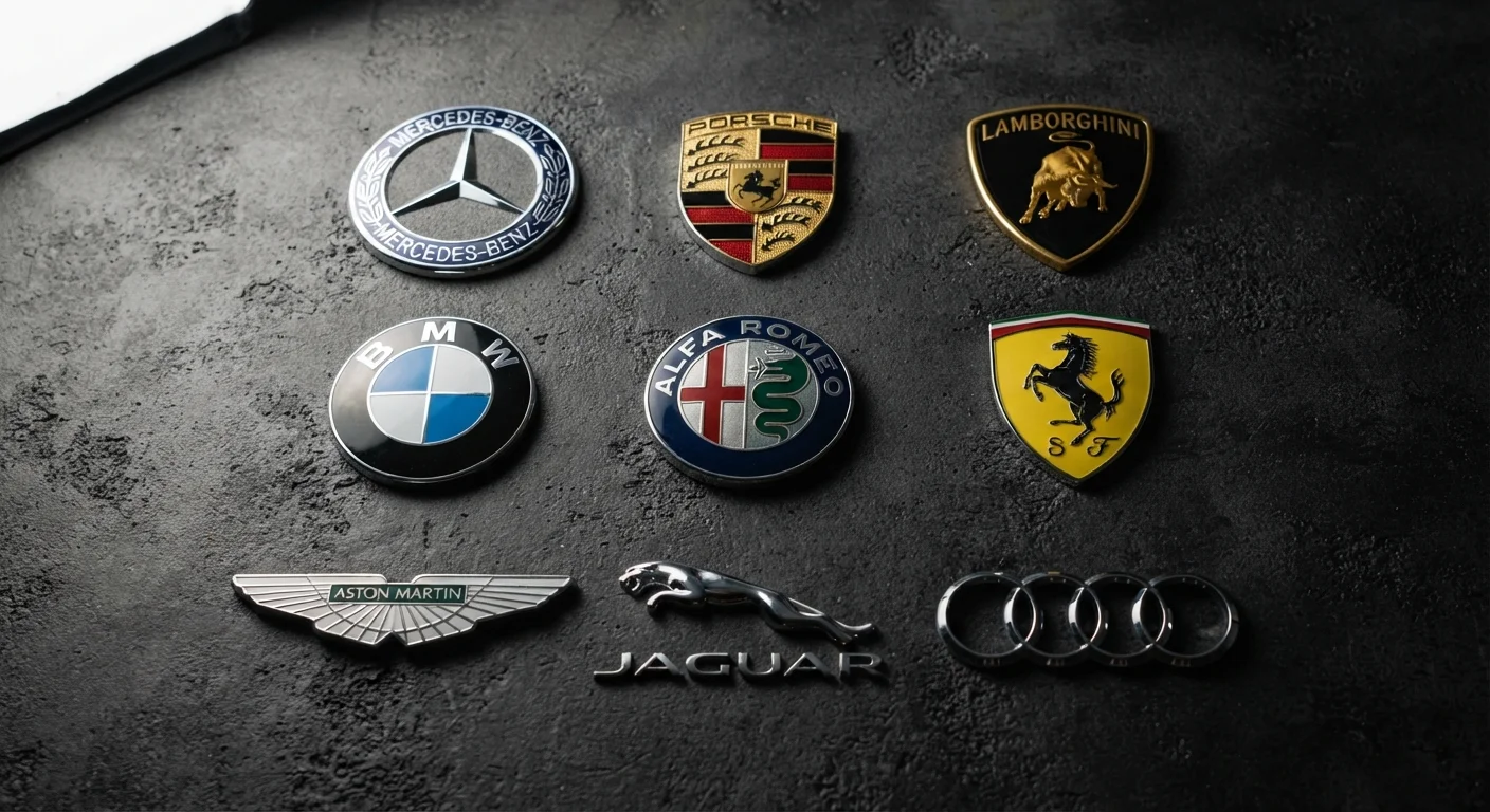
Photo: CoralScripts.com | Explore, Discover, Engage editorial
—— In This Article
Key Takeaways
- Car logos often encode founding history, national identity, or a founder's personal heritage.
- Animal symbols typically represent power, speed, or agility aligned with a brand's performance ambitions.
- Geometric and abstract emblems frequently reflect engineering precision or corporate lineage.
- A logo redesign is rarely cosmetic - it usually signals a strategic repositioning of the brand.
- Understanding logo symbolism helps readers better interpret a brand's heritage and market intent.
The Logo as a Compressed Brand Biography
Every car logo is a form of shorthand - a visual argument about who a manufacturer is and what it values. Before a single line of copy is read, the emblem on a hood or steering wheel is already communicating. Understanding how that communication works requires looking at the three primary categories of automotive logo design: figurative symbols, geometric abstractions, and typographic marks.
Figurative logos use animals, crowns, or other imagery drawn directly from history. Geometric logos encode structural ideas - unity, precision, movement - into abstract shapes. Typographic marks lean on the founder's name as the brand's primary asset. Most automotive emblems blend at least two of these strategies, and the choices made decades ago often still define how a brand is perceived today. To understand the full corporate context behind a logo, see our guide on automaker alliances and corporate structures.
100+
Years some automotive logos have remained in use
Several major manufacturers have maintained core logo elements - particularly animal symbols and founder initials - for more than a century, demonstrating the durability of well-chosen brand iconography.
3
Primary logo design categories in automotive branding
Industry brand analysts broadly classify automotive logos as figurative (animals, crests), geometric (abstract shapes), or typographic (monograms, wordmarks) - most emblems blend at least two approaches.
Animals, Crests, and Power Symbols
The use of animals in automotive iconography is deliberate and deeply rooted in cultural semiotics. A prancing horse on an Italian sports car originated not from mythology but from a specific piece of World War I aviation history - the emblem was associated with a decorated fighter pilot whose family crest the manufacturer adopted with permission. That provenance transformed a heraldic symbol into a racing pedigree.
Bulls appear on another Italian brand's badge, drawn from the founder's zodiac sign and his passion for bull breeding. Big cats - jaguars and panthers - appear on British and German marques respectively, chosen for their connotations of sleek, predatory speed. None of these choices were arbitrary. Each was a precise decision to borrow cultural capital from a well-understood symbol and transfer it onto machinery.
Animal logos also evolve. Brands modernize these symbols - flattening them, removing backgrounds, reducing detail - while preserving the core silhouette that decades of brand-building have made recognizable. The symbol endures; the rendering adapts to contemporary visual culture.
Geometric Logos and What Structure Signals
Where figurative logos tell stories through imagery, geometric logos make arguments through form. Four interlocking rings, for instance, encode a corporate merger history: the four companies that merged in 1932 to form the predecessor of a modern German brand are each represented by a single ring. The logo is, quite literally, an organizational chart compressed into jewelry-grade metalwork.
Circular logos suggest completeness and continuity; chevrons imply forward motion and hierarchy; overlapping shapes communicate unity from multiplicity. A Japanese brand's badge - three overlapping ovals - is described by the company as representing three hearts: the heart of the customer, the heart of the product, and the heart of progress. Whether or not consumers consciously decode this, the shape reads as integrated and harmonious rather than aggressive.
Look Up the Official Brand History
Most major manufacturers publish detailed brand heritage sections on their official websites, including the origin stories behind their logos. Cross-referencing these accounts with automotive history sources gives a more complete picture of how the iconography evolved - and where marketing mythology diverges from documented fact.
For brands built on engineering reputation, geometric precision in the logo is itself a statement of values. Symmetry, clean lines, and mathematical proportions signal that the people who made the badge also sweat the tolerances on the valve train. The visual vocabulary of the logo and the engineering vocabulary of the car are meant to reinforce each other.
The symbolic logic extends into naming as well. See how model naming conventions layer additional meaning on top of what the badge already communicates.
When Logos Change - and Why It Matters
A logo redesign is rarely just a visual refresh. It is a public declaration of strategic intent. When a legacy manufacturer strips the chrome surround from its emblem and renders it in flat two-dimensional form, it is signaling a pivot - often toward electrification, younger buyers, or digital-first brand experiences where a complex three-dimensional badge looks cluttered on a screen or app icon.
Conversely, a brand that restores archival logo elements is typically making a heritage play, reassuring existing customers that core values are intact even as products change. The relationship between logo evolution and brand repositioning is closely connected to how national identity shapes perception - a dimension explored in depth in our piece on how country of origin shapes brand reputation.
Logo Simplification and the Digital Shift
Many automotive logo redesigns since the mid-2010s have followed a consistent pattern: removing gradients, dropping three-dimensional effects, and increasing contrast. This is largely driven by the need for logos to render clearly at small sizes on digital interfaces - from mobile apps to in-car touchscreens - rather than solely on physical bodywork. The shift reflects where consumers now encounter brand identity most frequently.
Reading logo changes as strategic signals - rather than aesthetic choices - gives automotive enthusiasts and informed consumers a sharper lens for understanding where a manufacturer is headed, and what it believes its customers value most.
Frequently Asked Questions

Cars & Driving Editorial Team
Cars & Driving Editorial Team is the collective byline for our editorial team and contributor network. Articles published under this byline or an editorial pen name are researched, written, and reviewed according to our editorial standards for clarity, consistency, and independence before publication.
View author profile